What Is The Scandinavian Design Movement, and Why We Love It
/Since its emergence in the 1930’s, the Scandinavian design movement has become one of the most universally beloved. Inspired by the concepts of constructivism and functionalism, it’s all about creating a simple, practical home environment unencumbered by excess. It promotes a special brand of Nordic minimalism where clean, uncluttered spaces are still imbued with vitality and warmth. Here’s our break down of Scandinavian design principles.
Pared-back practicality made beautiful
Scandi design is all about the intersection of simplicity with functionality, the creation of stripped-back yet visually compelling designs. This might involve making walls into doors, or hiding storage where the eye can’t see. There’s nothing superfluous about Scandinavian design; beauty is found in the lack of adornment, in the absence of detail. Genius lies in rendering a product or feature into the most basic form of itself, without compromising aesthetic excellence.
Clean lines and strict geometry
Like everything else with Scandinavian architecture, shapes too are preferred in their simplest, most basic iteration. Lines are clean and form uninterrupted planes, homes characterised by long blank walls and uncomplicated silhouettes. In particular, Scandinavian architects love their triangular-shaped structures—especially when it comes to vacation houses.
Light and airy
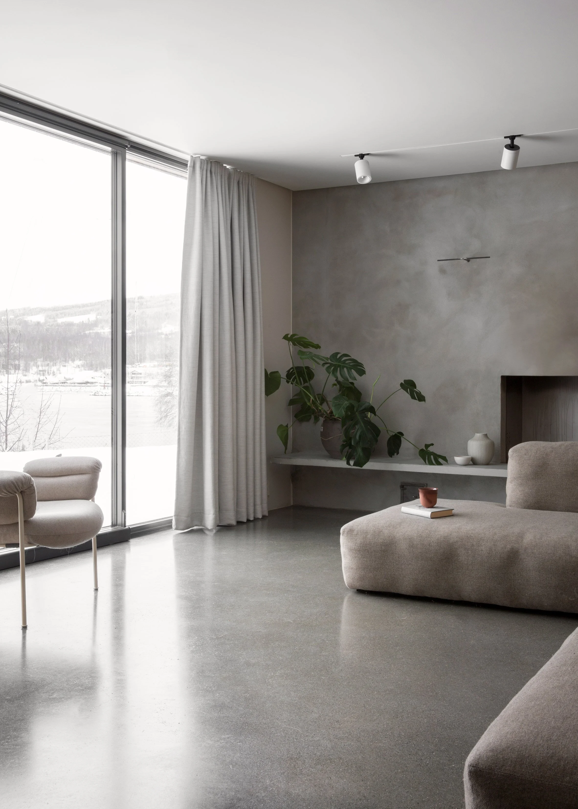
Although Nordic design is focused on forgoing excess, the one thing you’ll see featured excessively in Scandi homes is light. Trying to filter as much natural light into a space as possible with big windows, bright surfaces, polished textures or clever little skylights—it all hails back to the region’s unique weather, where daylight is often scarce. Combined with the creation of large, open spaces (or at least the illusion of such), the result is something which feels bright and airy even when the sun is nowhere to be found, or the cold means cracking open a window is impossible. All that light and space is why Scandi design is so often praised for its peaceful, calming effect.
Organic, natural materials
One of the movement’s guiding principles is establishing a connection to the environment. Timber, raw textured walls, and concrete are all favourites for spaces of Scandi design—natural materials and organic textures which visually represent that stripped-back beauty we were harping on about before.
A simple, monochromatic palette
Whilst vintage Ikea might have been all about the bright and unorthodox (think lamps which look like miniature space ships, or bright yellow couches), it was always in a monochromatic sense; you picked one hue and stuck with it, or you accented a white-on-white scheme with carefully considered pops of colour. A simple, uncluttered palette—whether it be completely neutral, accented by muted tones, or champions a single brighter colour—is one of our favourite legacies of Scandi design.


