Alt. Favourites: Six of the Best Retail Store Interior Designs
/When it comes to retail, first impressions matter. The design of a store can significantly influence the customer experience and brand perception, making it essential for retailers to create inviting and visually appealing environments. In this blog post, we’ll explore six retail stores with beautiful interior designs. From microcement walls to installations inspired by nature, these stores are both innovative and unique.
x-bond microcement flooring at viktoria and Woods Chadstone ( photography by Timothy Kaye)
designer: design by golden
Viktoria and Woods Chadstone (An X-Bond Project)
The design of the Viktoria and Woods Chadstone store emphasises a modern and luxurious approach that reflects the brand’s ethos. The smooth, seamless X-Bond Microcement flooring and textured walls are characterised by a neutral, muted colour palette that create a minimalist aesthetic throughout the store.
Want the same look in your next Melbourne project? Enquire about X-Bond Microcement flooring installation with our Alternative Surfaces team here.
Aesop Francs Bourgeois, Paris
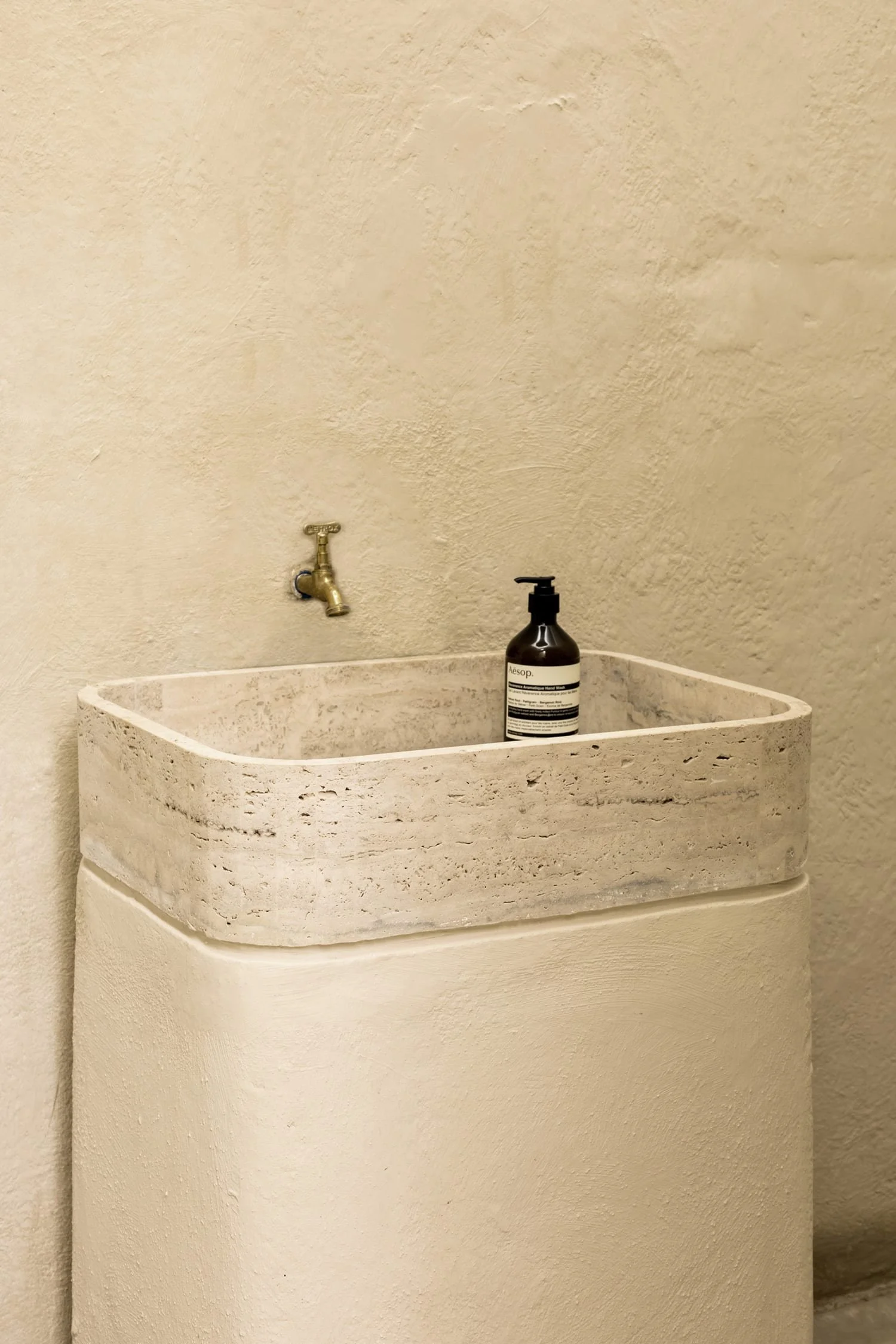
Aesop stores are known for their beautiful design and are often inspired by the city they reside in. The Paris store is no exception, featuring a textured finish on its walls to create a meticulously crafted environment that resembles one of Paris’s oldest planned squares, the nearby Place des Vosges.
Glossier, Seattle
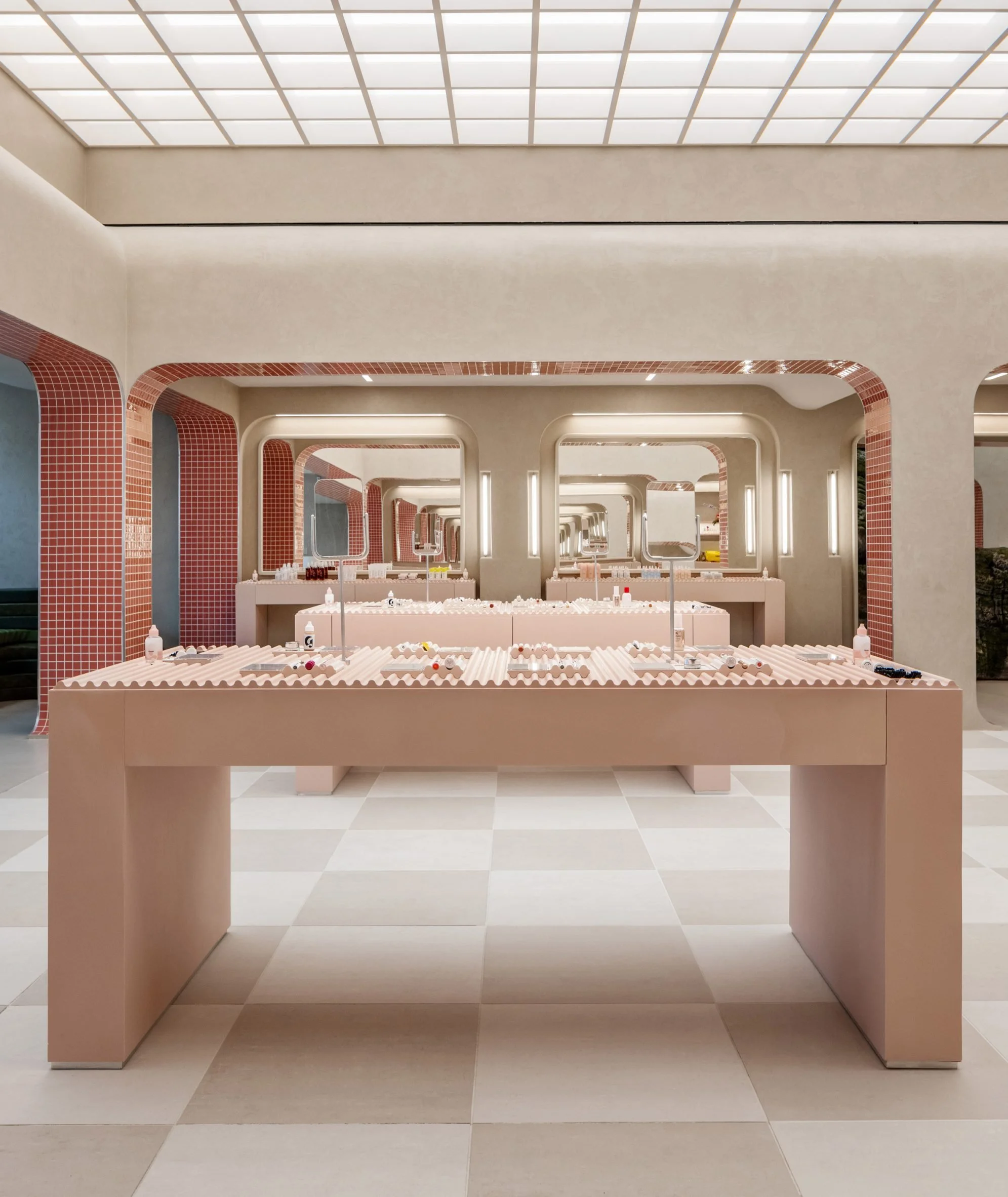
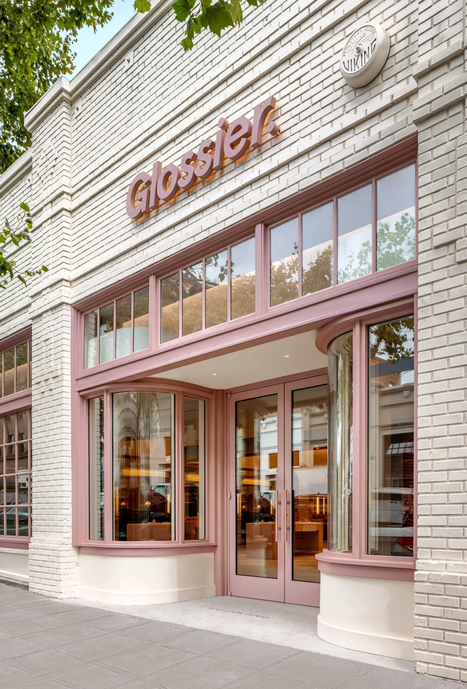
The Glossier Seattle store features a striking moss-covered mound as its centrepiece, creating a unique and organic focal point within the retail space. This eye-catching design element combines natural textures with the brand's signature pink aesthetic, creating a visually captivating and memorable shopping environment.
Photographer: Haris Kenjar
Designer: Studio Lily K Wong
Haight fashion store, Rio de Janeiro
This luxury swimwear store features a cave-like interior. Located in Brazil, the store showcases microcement throughout its interior to create a natural, minimalist aesthetic.
Photographer: Fran Parente
Designer: MNMA Studio
Mimco Chadstone, Melbourne
Mimco’s flagship store features a refined colour palette, bold seamless curves, and layered materiality that reflects the brand’s heritage and evolution. The stripped-back palette puts a focus on Mimco’s products and creates a luxurious atmosphere.
Photographer: Timothy Kaye
Designer: Studio Doherty
Le Labo, Kyoto
The Le Labo store in Kyoto blends traditional Japanese architecture with the brand's minimalist aesthetic. The facade honours the surrounding streets of old Kyoto, while the interior incorporates a mixture of dark wood, exposed brick and antique concrete that allows Le Labo’s brand identity to shine through.
Photographer: Le Labo
Designer: Schemata Architects


